General Notes (H3)
The Internet
Origin and reason why the Internet came to be.
SUMMARY: The Internet was created by our military and it was meant to be a means of communication able to survive a nuclear attack. If one section of the network went down, messages could just reroute using different paths to get information where it needed to go.
3 parts to the Internet
- Surface web
- Deep web
- Dark web
(H3) Google Search (in depth Internet):
The U.S. military created the precursor to the internet, ARPANET, through the Department of Defense's Advanced Research Projects Agency (ARPA) during the Cold War primarily to build a resilient, decentralized communication network that could survive a nuclear attack by having no single point of failure, allowing leaders and researchers to share information even if parts of the infrastructure were destroyed. This network used packet switching to send data in small pieces, ensuring communication could reroute if lines went down, evolving from a defense tool to the global Internet we know today.
HTML and CSS
Words to know
HTML - (stands for HyperText Markup Language) a standardized system for tagging text files to display font, color, graphic, and hyperlink effects on World Wide Web pages
HTML tags - An HTML code that defines every structure on an HTML page, including the placement of text and images and hypertext links
Text formatting - Text that contains codes for font changes, bold, italic and other page and document attributes
Browser - application used to access the Internet and view web pages
URL - stands for Uniform Resource Locator and is the www address of a website
File extension - a group of letters occurring after a period in a file name, indicating the format of the file
Hyperlink - a link from a hypertext file or document to another location or file, typically activated by clicking on a highlighted word or image on the screen
Root directory - the top level (main) folder that stores all files associated with a website
OS - (stands for operating system) the software that supports a computer's basic functions, such as scheduling tasks, executing applications, and controlling peripherals
WYSIWYG - (stands for What you see Is what you Get) software that makes it easier to create using a graphical user interface (GUI)
GUI - (stands for Graphical User Interface) everything you see and interact with on the screen
Internet history - The Internet was created by our military. The first network of computers was called the ARPANET.
File extension- what is it? A file extension is a 3- to 4-letter suffix at the end of a filename (e.g., .docx, .jpg, .mp3), separated by a period, that identifies the file format and its corresponding application. It enables the operating system to determine which software to use for opening or editing the file.
List of known file extensions:

| .txt | Text file |
| .html | Hypertext Mark-up Language |
| .docx | MS Word - word processing doc |
| .jpg | Joint photographers experts group |
| .gif | Graphics Interchange Format |
| .png | Portable network graphic |
| .exe | Executable program |
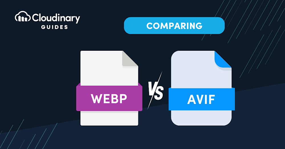
| .web .webp | are newer file extensions that usually just waste your time because the reason we run into them is because we are looking for an image we can use. So some jabroni thought it would be funny to create a viewable file that can't be downloaded as an image normally. Jabroni. (they actually speed up load time) |
| .xyz | is a a plain-text ASCII file format commonly used to store 3D coordinate data (X, Y, Z) for points, often generated by 3D scanners, CAD software, or molecular modeling programs. None of us really need to know this one. |
Key details about file extensions include:
| Purpose: | They tell the computer how to handle the data, such as whether it's a document, image, or executable program. |
| Structure: | They are positioned after the last period in a filename. |
| Functionality: | Changing the extension does not convert the file format; it only alters how the operating system attempts to open it. |
| Visibility: | Many operating systems may hide extensions by default to prevent accidental modifications. |
Examples: Common examples include .pdf (document), .jpeg/.jpg (image), .mp3 (audio), and .exe (application). |
|
Final Notes On Site Management
Site map - a visual representation of an entire website and it's paths of navigation.

Root folder - the main folder in which all assets for a website is contained.
DESIGN Principles For Web
Visual design elements and principles describe fundamental ideas about the practice of good visual design. Nevermind what William Lidwell says.
Axis Principle
Axis is the most basic and most common organizing principle. Simply stated, axis is an imaginary line that is used to organize a group of elements in a design. In diagrams, axis is represented as a dashed line. Where is axis in the worst website?
Axis is mainly used to align elements. When elements are arranged around an axis, the design feels ordered. As with most things in life, we enjoy things that are ordered because they feel more stable, comfortable and approachable. cAN you find it?
A simple example of axis is the descriptions shown at Crypton. In this design, a vertical axis neatly aligns descriptions on the left side of the screen while visuals appear in what is called a parallax effect on the right.
ReinforcementAlthough axis is an imaginary line, you can make it more apparent if the edges of surrounding elements are well defined. A common example of this concept in architecture is a city street. The city street is an axis that is reinforced by the buildings on both sides. If a portion of the street is missing a building on one or both sides, the street’s axis would not feel as strong.
An example of this in product design is the timeline in the Twitter app. In this design, a vertical axis helps define a section for avatars on the left and a section for tweet content on the right.
When we encounter something linear, such as an axis, we naturally follow the line in a direction. If we arrive on a street, we walk down the street. If we open an elevator into a long hallway, we walk down the hallway. Lines prompt movement and interactions. The direction of movement depends on the end points. A defined end point signals a place to start or stop.
An axis that encourages movement is the music scrubber in the SoundCloud app. In this design, you recognize the scrubber as a left-right axis, and naturally slide the scrubber to the right until you reach the end of the song.
If an end point is undefined, you will follow the axis until you reach something of interest or are tired of interacting with the axis. While the concept of an undefined end point in architecture is uncommon since it's difficult for something architectural to go on forever, it's becoming more popular in product design with infinite scrolls.
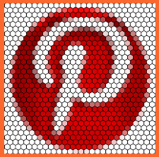
An example is an infinite scroll is the main feed in the Pinterest app. In this design, the vertical axis starts at the top of the screen then continues downwards without a stopping point. This encourages you to scroll down the page for as long as you're interested in viewing pins. Also archive.
Back to table of contents for DesignSymmetry Principle
Symmetry is when elements are arranged in the same way on both sides of an axis. Perfect symmetry is when elements are mirrored over the axis and exactly the same on both sides.
Symmetry adds balance to a design. When elements are the same on both sides of an axis, the design feels harmonious. If we design a street with five houses on one side and five on the other, walking down the street would feel comfortable because the arrangement of homes is balanced.
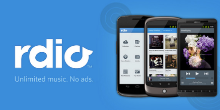
An example of symmetry is the arrangement of music covers in the Rdio app. Elements on both sides of the screen are the same format. This type of layout is easy to read top to bottom and left to right.
Designs are asymmetrical if the arrangement of elements are different on both sides of an axis. If we design a street with five houses on one side and one on the other, the street will feel unbalanced and perhaps uncomfortable.
An asymmetrical design is the feed in the Pinterest app. Although the left and right columns are the same width, the height of elements in each column varies. The variances make it difficult to scan from left-right. Even the slightest bit of asymmetry can throw off the balance and comfort in a design.
Back to table of contents for DesignHierarchy
Hierarchy is when an element appears more important in comparison to other elements in a design.
SizeAn element will appear more hierarchical if it is larger than other elements in a design. We naturally look first at the largest element in a design. If there are five windows on the front of a building, and one is twice the size of the others, our attention will focus on the biggest window first.
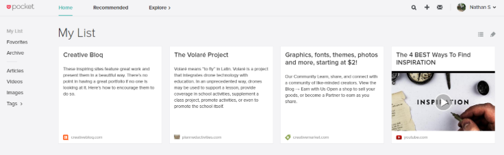
An example of hierarchy by size is the article list in the Pocket app. The header article is featured at the top, with a larger picture. Due to it's size, it catches our attention first.
 Shape
Shape
An element can also appear more hierarchical if it is different than other elements in a design. We naturally look first at the irregular shape in a design. If there are five of the same windows and one door on the front of a building, our attention will focus on the door first.
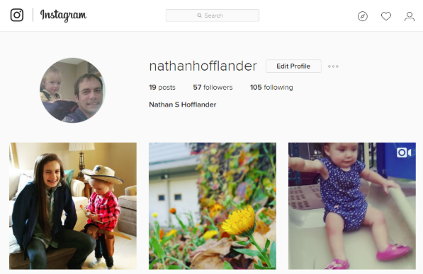
An example of hierarchy by shape is the profile page in the Instagram app. The circular profile picture is distinctly different than the square instagrams. We recognize the profile picture as something unique and more important.
Last but not least, we can place elements in more hierarchical positions. Within a circle, the center is the most hierarchical. The end of an axis is naturally more hierarchical than points along the line. An example of hierarchy by placement is the timeline in the Path app. The avatar is the starting point of a long axis, and therefore has a higher level of importance than the avatars on the left in the stream.
Rhythm Principle
Rhythm is the movement created by a repeated pattern of forms.
PatternThe best way to understand rhythm is to think of a song. Songs have rhythm when a piece of the song repeats. When listening to a song with good rhythm, we recognize the pattern and begin to expect beats.
An example of rhythm in product design is the Airbnb app. In this feed, each listing is displayed with a picture, price, location and owner avatar. When scanning the feed, you begin familiar with the rhythm and know exactly where to look for elements in the pattern, such as price.
BreaksA break in rhythm will appear more hierarchical. Think about a song. When a song has a repeated rhythm and the rhythm is broken, something quite special usually happens.
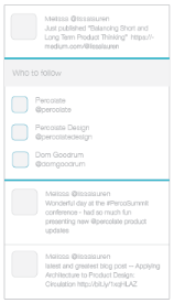
In the Twitter app, the profile feed has a rhythm and is broken by a section with suggestions of people to follow. This break appears more hierarchical and is a good way of grabbing your attention.
That's it for now! Check back periodically for updates. Add a header and footer to this document using External Style Sheets.
Back to table of contents for DesignProject Management
During this unit we will learn about some ways dev teams operate in a working environment. (AGILE VS Waterfall)
AGILE - Agile project management is an iterative, flexible approach focusing on delivering small, functional project increments rather than one final product.
Waterfall - The Waterfall methodology is a linear, sequential project management approach where each phase—requirements, analysis, design, implementation, testing, and maintenance—must be completed before the next begins.
Phases of web development
In this final unit, students will engage in completing a Semester Portfolio, showcasing all their work, start to finish.
Some elements include:
- Creating a sitemap
- Planning out an entire website
- Apply design principles using CSS
- Debug and test site for GoLive!
- Upload to the K12 webserver!